About
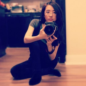
Who is Phoenix?
I’m a Chinese American female living and working in Toronto.
I studied Marketing Management for three years in my first college and finished up my last year in a second college, studying Business Marketing. Since then, I found myself working as a Graphic and Web Designer for international Digital Production and Web Service companies as well as a UI/UX designer… Go figure… The economy sucks. Always have a backup.
What is TFL Design?
The Forgotten Lair is an Anime graphic and resource site that offers the wise ramblings of your host, Phoenix. It also features non-Anime related content such as celebrities, games, TV series and movies.
I’m also hilarious to talk to, so feel free to follow me on social media. FACEBOOK and INSTAGRAM are my most active playgrounds.
History
“The Forgotten Lair” derived from a cokemusic.com studio I named, since “The Lair” had been taken back in 2002-2003. I started a guild on neopets.com on August 19, 2003, naming it “The Forgotten Lair” and started to make graphics for it, with the help of my High School friend RTWK. I created an anime graphic site on December 29, 2003 (hosted on Freewebs and opened to guild members only) and then moved the entire site to RTWK’s server around January, 2005.
My skills were not really developing until about September 2005. It was then I had joined AnimePaper, a wallpaper community with members that taught me what REAL graphics were all about. (With the use of harsh criticism and incredible inspiration.)
At first, the goal of this site was to enlighten Neopians of Animes outside the U.S./Canada and provide layouts, but on May 4, 2007, I officially stopped making Neopets Layouts and re-opened the site as version 10- Anime Graphics and Resource site. That is because Neopet’s sudden change in layout earlier that week made most of the layouts useless, thus forcing me to quit and re-evaluate my life, then search for a real social life. Plus I didn’t feel like recoding a few hundred layouts or redo their graphics.
On October 4th, 2007, I moved to another host, receiving my own domain, https://www.theforgottenlair.net. The goal of the site was to cater to the Anime Fans of MySpace with quality graphics. Particularly graphics that aren’t pink and glittery and/or are stolen/cropped images from wallpapers, scans, etc. And although Wallpapers are not requestable, they are my most rewarding projects.
On March 26th, 2011 I removed all MySpace related content and trimmed down on everything that wasn’t being updated, leaving only Avatars, Wallpapers, Textures, Tutorials, PNGs, Gallery, Anime Reviews and Brushes. The purpose of this was to ensure only quality things appeared on this site, as I had made my standards higher since working in the field professionally.
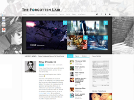
October 26, 2013 – Current
Version 18 was the next installment of the WordPress-based themes. This layout focused more on fluidity and the ability to adjust to different browsers and mediums. (Mobile, etc.) There’s also a more spacious feel to it, in comparison to its predecessor. The featured area would promote the latest items in its respective categories and the top image extended to two monitor’s width, adding some fun and life into the website.
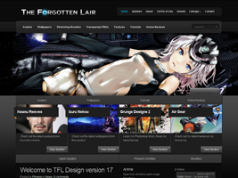
March 26, 2011 – October 26, 2013
Version 17 was the beginning of a new stage in TFL Design. Since Phoenix had been working in the creative field professionally, she felt her personal website should reflect her current standards, therefore it was given an overhaul and refashioned as a semi-blog site with WordPress integration. The site was given a darker and more professional looking feel and navigation.
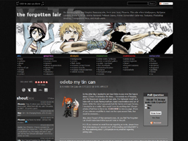
February 10, 2010 – March 26, 2011
I wanted to create a “cleaner” and more spacious feeling layout. Most importantly, I was tired of dropdown menus. In Version 16, the navigation links are in plain sight and the content aren’t as squished by unnecessary lines or colors. Also, a much darker background to read off of, for the night viewers that don’t want to stare at a bright light. Of course, the banners rotated – a feature that will probably stay with this site forever. (or not)
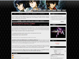
February 18, 2009 – February 10, 2010
Version 15: After a short run with the “widescreen freedom” experience, I felt the site needed borders and darkness again. Once again, the site header rotated and with the new dropdown menu, the pages were easier to navigate through.
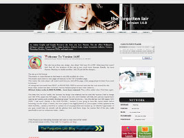
October 13 2008 – February 18, 2009
I had gotten a new widescreen monitor and realized how crowded the previous version looked, so Version 14 was created to fit both widescreen and normal resolutions. It was also the massive change from HTML/iframes to PHP. I wanted to make browsers happier as well… As always, the images on the header rotated.
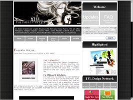
Around April 2008 – October 13, 2008
Version 13 reverted back to the massive scrolling problem, however it was my greatest design at the time. It was so sleek and professional-looking, that even though the main content creates a double scrollbar, I didn’t care. The header image rotated and the links are primarily on the right side, save the few squares on top. The header once again, rotated over a hundred different images.
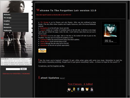
Around January 2008 – Around April 2008
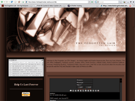
Version 12 was my solution for the double scrollbar my iframe layouts tend to cause. (My layouts MUST be iframes so that my music player wouldn’t repeat itself when browsing the site.) What was cool about the layout was that the left side would rotate over a hundred different images – most of which were raw scans. I never gave the number out and urged visitors to guess instead. This layout was the first time a search engine had been introduced as well. The navigation had a cool hover and drop down action IF you were using anything above IE6.
Around November 2007 – Around January 2008
Version 11.5 was the quick result of the survey. Hoping this would be slightly more masculine or less feminine, I’d created this in a short time. However, due to its massive scrolling length, it was short lived as well. People said it was chocolatey in color, which I found weird. I swear my computer screen showed more of a pink shade. You might notice the screenshot’s shoutbox does not match its layout. That’s because I took it after I tore this layout down.


October 4th 2007 – Around November 2007
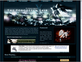
Version 11 of The Forgotten Lair was the first version in the new domain. (www.theforgottenlair.net) The original idea was to make the layout red and black while working on the header image, but somehow it ended up pink, and therefore, so was the rest of the layout. With a survey taken, about 25% of the visitors (mostly female surprisingly…) thought it was feminine.
Around April 2007 – October 4th 2007
Version 10 of The Forgotten Lair back in http://theforgottenlair.doesntexist.com – The last version on RTWK’s server and only memorable layout recorded. (Probably the only one worth recording…) I liked the header image so much, I created a wallpaper out of it. I loved the contrast of colors and overall calmness of the tones… It was during this time that I had quit making Neopets graphics due to their numerous site changes.
Around March 2007 – Around April 2007
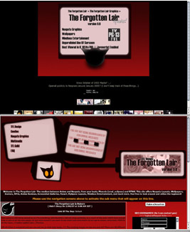
This screenshot of Version 9 of The Forgotten Lair was taken by Andy. This was the second version I had made a layout featuring Kit-Chan, the TFL Design Mascot. The idea was that the images in the right screen would rotate every 10 seconds or so, and the other screens were used for navigation. The screen with Kit-Chan in it was the link to the Main page and would change to a picture of her nodding up and down when hovered over. I had wanted to make this layout in flash, but couldn’t find the time/skill to. Unfortunately, there were many who found the navigation diffictult to understand and the colors of the background hard to read against at times.
The top image shows the the splash page.
Around June 2006 – Around March 2007
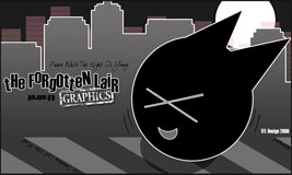
Only the header image remained in my archives of this layout. This was the time I began to improve on my vector style sense and created this cheery setup. This was the first version I had made a layout featuring Kit-Chan, the TFL Design Mascot. (For what it’s worth…) Like all my earlier layouts, it was made out of DIV Tags and iframes.
Around April 2006 – Around June 2006
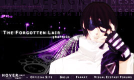
I was crazy with the site layout changes back then. They came often. Only the header remains of this layout in my files. My style had improved steadily and this layout featured one of my favorite boys from Get Backers. I loved the colors and subtle designs I’d placed in the background.
Around March 2006 – Around April 2006
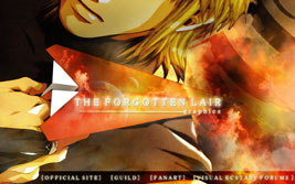
Only the header remains of this layout in my files. It was at this point that I was developing my blending techniques, especially with fire/cloud stocks. Like all layouts at this point, it was with DIVs and iframes. The layout featured Genjyo from the Saiyuki series.

Around January 2005 – Around March 2006
I don’t have a file on what this layout looked like, nor do I remember much about it. I do remember it was red and had basically the same layout as the one that came before it (See Below), including brushing and coding. It was the layout change after the December holiday layout.
Around December 2005 – Around January 2006
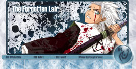
Only the header remains of this layout in my files. I was trying out the new brushes I had acquired from a friend at Jayson Designs and was a member of their forum, Visual Ecstacy (spelling error intended). These were some of the people that helped me grow on AnimePaper. The layout was designed for the winter/holiday season.
Around September 2005 – Around December 2005
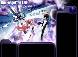
Only the header remains of this layout in my files. This was my first layout on my friend RTWK’s server and subdomain, with a redirect URL of http://theforgottenlair.doesntexist.com. Before this, my site was hosted on Freewebs and was private to Neopets users (mostly from my guild). At this time, I was crazy about my new discovery of Photoshop Brushes and thought that metallic blending thing looked cool… The site was called The Forgotten Lair Graphics (to differentiate from The Forgotten Lair Guild – where my life revolved around back then) and had a logo of some sort at the time.

Around ??? 2004 – Around January 2005
I don’t have a file on what this layout looked like, but it featured Alex Rowe from the series Last Exile. It was all Divs and iframes and by today’s standards, pretty ugly. The site I remember, was a mix of dark green, beige and brown. The site was hosted on Freewebs and was designed to supply graphics to mostly my guild members of Neopets.

December 29 2003 – Around ??? 2004
I don’t have a file on what this layout looked like, nor do I remember much about it. I do remember it was a Gundam theme and sort of dark blue and gray color. I believe the featured mech was the Blitz Gundam of Gundam Seed. It was all Divs and iframes and by today’s standards, pretty ugly. The site was hosted on Freewebs and was designed to supply graphics to mostly my guild members of Neopets. It was my first time creating a website.


