One thing I’ve noticed with novice users of Photoshop and Photoshop brushes is that people tend to feel the need to fill up every available space on a piece. Especiall if they feel the focus of the piece is too small or happens to be centered. Keep this in mind – Negative space is GOOD. It gives a focus point and prevents your piece from looking like a ball of mess. I will be using Wallpapers from AnimePaper.net as examples of how to apply brushes in a good way. The best way to learn is by example.
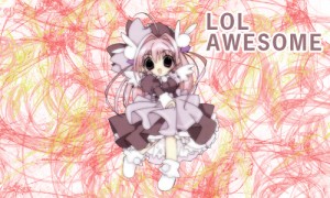
So what you don’t want to do is this:

Notice the use of stamp brushes has been used to create a “pattern” of some kind in the background? Well generally it looks really bad. Brushes with a specific pattern, whether it be a grunge, vector or pattern brush generally look better when used sparingly. Also, people tend to be afraid of arranging text over the character, thus placing the text in the last available spot on the piece – which usually looks out of place.
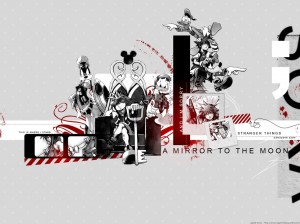
Now let’s look at some good stuff:

Take Yamaro’s piece for instance. It cleverly uses brushes, shapes and typography to add to the piece, rather than take away from the focus of the character. Usually the way to do it is to brush closest to the character, rather than fill the whole canvas.

Anbuu’s piece here is slightly off center, giving it a very stylish and active feel.
In general, the middle is the most obvious and boring place you can put something. Try to spice things up by not putting things in center, but still follow The Rule of Thirds.
Also notice how the text is placed.

SohoDoll’s use of brushes accents the piece quite nicely. Once again, the negative space is important.
In conclusion, allow for some empty space in your pieces. They tend to be more stylish, last through the trials of time, and don’t look as flat. Rather than throw the brushes all over the sides and frame or surround the character, try brushing behind or closest to him/her. You can have a few sporadic ones to add flavor, but remember the character is the main focus.


